Graphic Design
As Camp Fire Alaska’s in-house designer, I spent several years creating promotional material, and in some cases completely overhauling dated or off-brand materials. Design materials produced for CFA ranged from apparel, trading cards, print/digital advertisements, annual reports, promotional materials, program handbooks, and more.

Back to School Ad - Camp Fire Alaska, Fall 2019
I created this ad in a variety of sizes and formats, with this one optimized for print in the Anchorage Daily News. Feeling inspired by this photo of fruit sculptures (and, of course, adorable kids) snapped in one of Camp Fire’s summer programs, I decided to make my own digital fruit sculpture of Camp Fire’s logo, using the quintessential scholastic apple.

Rural Alaska Map - 2019 Communities
Camp Fire Alaska’s Rural Program sends small teams into Alaska’s Rural Communities to deliver health and wellness initiatives, as well as traditional summer camp fun. It’s an ambitious, sweeping program made possible through the support of community partners, and Native Health Corporations. The map I created for the 2019 program lists visited communities, and celebrates the many cultural regions of Alaska Natives.

Invisible Ink - Camper Shirt Mock-Ups
For the second year, I created these interactive camper shirts for Camp K, Camp Fire’s residential camp in Cooper Landing. These shirts print the design (my original illustration) in white ink, on a white shirt. At the time of distribution, campers think they’re receiving a blank white shirt. It’s only when they start their tie-dye activity that the design reveals itself.
I am extremely proud of this shirt. I like the design, but more importantly, I was determined to create a piece of memorabilia which would be an experience in and of itself. I love the idea of interactive design and art that needs audience participation to come to life, rather than being passively enjoyed.


Summer Camp Brochure - Camp Fire Alaska, 2019
The two images above make up a brochure I created to promote Camp Fire Alaska’s summer camps. The fire symbol on the left is hand-drawn, and each camp logo was created by me. It was a challenge to fit all the written content on the brochure in a way that wouldn’t overwhelm the reader—especially the field trips for Camp Si-La-Meo!
I am also a fan of the text-art hidden in the accent trees, and how it ties back to the larger, slightly techie #HelloSummerCamp theme.

Vinyl Welcome Banner - Camp Fire Alaska, 2019
I created three banners (of similar design aesthetics) for the 2019 Summer season. Artwork is my original illustration, and all content was designed to be instantly recognizable as being in alignment with Camp Fire branding.

Camp Si-La-Meo Map - Camp Fire Alaska, 2019
As someone with woefully under developed spacial reasoning skills, this map was a challenge! Its creation was necessary for instructing parents on finding their new pick-up/drop-off location. I pulled from the University’s map, Google Street View, and my own walk-through experience when laying out this document.
As someone who frequently struggles (or outright fails) to understand maps, I focused on creating a guide that would be easy to follow, and aid the viewer in naturally eliminating unnecessary information.

Summer Camp Promotional - Flyer, Double Sided
This flyer contains the bulk of content used for Camp Fire Alaska’s 2018 push — the front of the flyer was repurposed and resized for print and digital advertisement a few times over, while the back of the flyer was recycled for appeals to internal audiences.
Concept, design, copy, and tiny camp fire symbols created by me.

Kindergartener Flyer
This flyer is aimed at selling Camp Fire’s Before and After School programs to families just entering the school system. I chose a rocket ship to stand as the visual metaphor for discovery, excitement, and new beginnings.
By pitching program strengths through little blurbs/bubbles (almost like a product design diagram) I think I achieved a thematic and visual harmony that stayed playful and visually exciting.

Trading Cards - Camp Fire Alaska, 2019
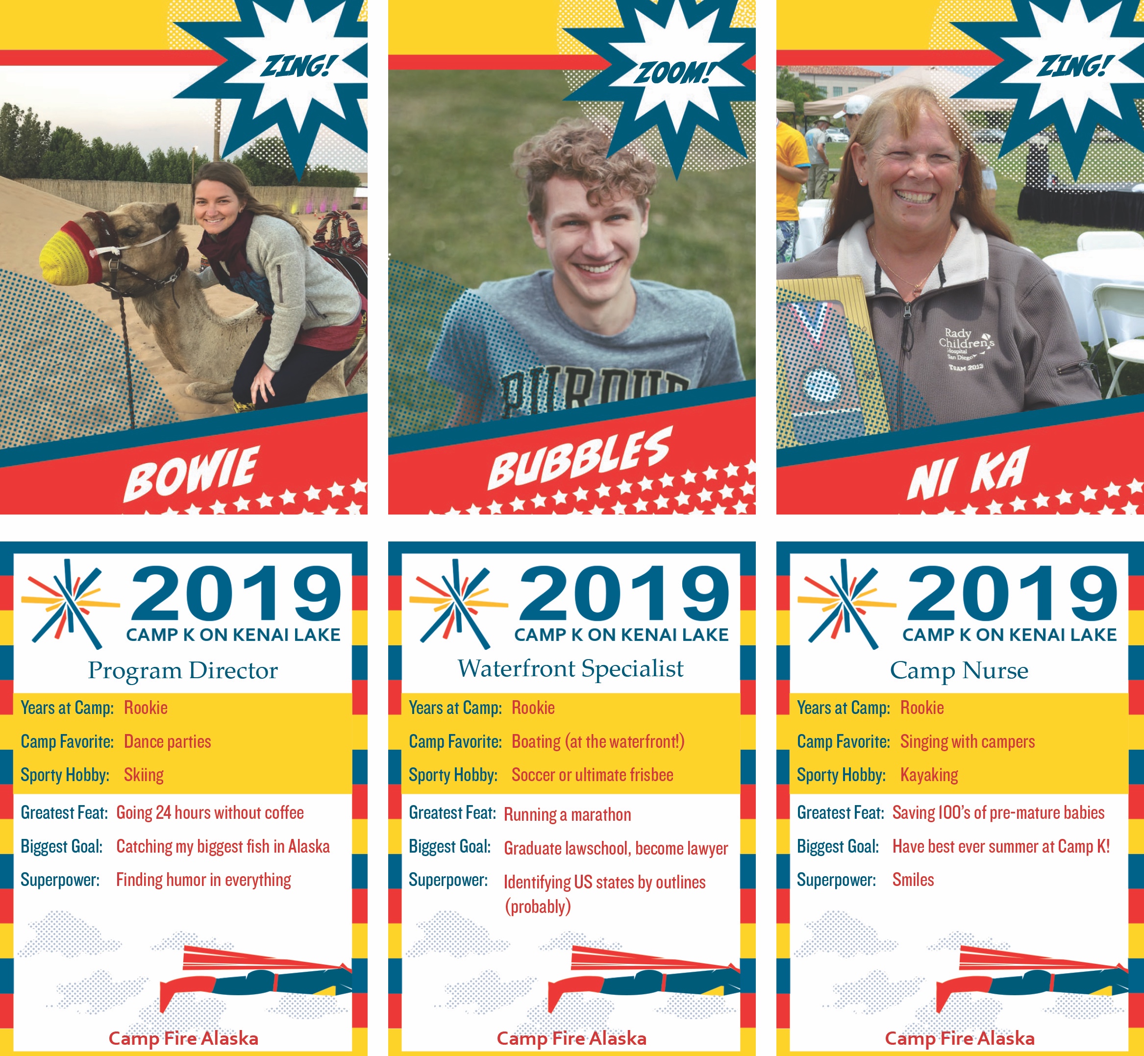
Every year, summer camp staff receive a number of trading cards which they can distribute to campers who complete certain challenges. As an example, one staff member, responsible for teaching kids about Nature, would only part with his card if a camper were able to successfully bring him a living bug.
For 2019, I decided to design cards with a superhero theme! It was fun to reference the pop-art printing seen in the 50s (see the clouds), along with designing a Camp Fire-branded hero.

Camp Digital Graphics - Spring, 2019
Pictured here is a collection of graphics I created for web/social media during the spring of 2019. I like each for different reason — the implied target from the archery graphic, the tension and pop-art feel of the egg graphic (and the fact that the blond boy is wearing a shirt I designed), and the image/text interplay in the bottom graphic all strike me as fresh, visually interesting pieces.
The ad pictured below is the one used for print, and was published in a variety of newspapers across the Anchorage/Matsu-Su area.
