


The Alaska Democratic party is my most prolific client for contracted design work. I have created candidate logos, digital advertisements, physical materials for distribution, social media graphics, and more.
A long-standing client, in a spectacularly romantic move, commissioned me to create several different logo concepts as a Christmas present to his sweetheart. Her organization, No More Free Passes, began in answer to a prosecutor’s comments on a controversial sexual assault case in Alaska.
You can check out NMFP’s website, in addition to the winning logo, here.
A sample of different political ads I have created of the years. Typically, a digital ad pack will feature the same content resized and repurposed in five different ways. These ads are meant to appear as pop-ups for desktop and mobile screens.
I created this logo for Debra Call, based off of a sketch she sent me. The primary sketch featured Call’s name, with some squiggly lines underneath.
Call is Alaska Native, and after I discussed her idea further, I learned that she felt it important her logo represent her cultural identity. The squiggly lines she’d added beneath her name were meant to represent a river, or the threads used for traditional bead work.
Armed with this knowledge, I researched traditional native Alaskan beading patterns, and used my discoveries as the template both for her salmon artwork, as well as the band at the foot of her logo - which is based on a traditional river pattern as seen in Native Alaskan beadwork.
I found this project and Debra’s response to be immensely rewarding. I relished both the learning opportunity, and the chance to visually tether Debra’s identity to her cultural roots.
I was getting tired of all the flat backgrounds in the ad work I was seeing (and creating). I ended up really loving the texture, depth, and relevance that a blackboard brought to her design. To round things out, I sketched up her call-to-action font too.
Whenever possible, I like designs to tell stories. Even better if the story is funny. In a few other drafts, I had manipulated the image so that the snowman was frowning while the reindeer happily enjoyed his carrot-nose. Unfortunately, this was judged out of step with the holiday mood.
One of my first paid jobs for the Alaska Democrats. Memorable in the discovery that there are two Alaskan Bill Sheffields who look remarkably similar. I accidentally used the wrong one, which somehow nobody noticed until almost the final draft! It was a mortifying but ultimately valuable lesson on the importance of triple-checking content before leaping into the design phase.
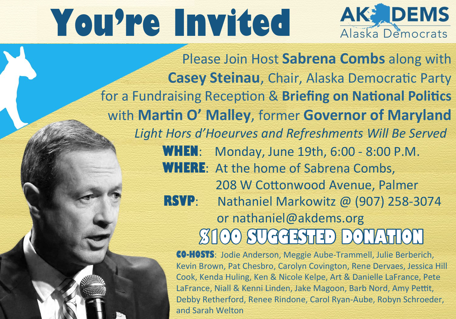
If nothing else, I am proud of myself for managing to squish this amount of text onto a fairly small canvas. From a design perspective, I really enjoy the way mixing black-and-white photography with colored design draws the eye to O’Malley.